A REFRESH AND UPDATE TO A 10 YEAR OLD TRADITION
In continuation with their re-branding initiative, the dance academy sought to refresh and modernize the branding for their annual "Year in Motion" dance recital. The branding was to be established through the designs of their recital poster and programme book.
PROJECT DELIVERABLES
Develop new professional designs for their poster and programme book (~44 pages). The poster is used for print and social media advertisement, while the programme books are distributed at the recital for attendees.
CLIENT INTERVIEWS
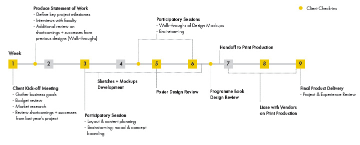
At the start of each year's project, I would initiate a client kick-off meeting to gain an understanding to the academy's business goals, competitive landscape, and review the short-comings and successes from previous year's design. This process helped me to define a list of priorities, confirm the project goals/requirements/limitations, and better understand how to frame the design and presentation of content.
Sample Questions:
- How has your clientele change from the previous year(s)? What type of clientele are you trying to attract for next year(s)?
This helped to organize and frame the content according to demographic changes in the Academy's clientele.
- Can you share some of the Academy's achievements for this year? How did you stand out in the community?
This helped align my design implementation to support how the client wants to be positioned in their market.
- What did you like the most and least from last year's recital poster/program book? Are there any external samples that catch your eye?
This also helped to identify conceptual gaps and realign the visual vocabulary to refine the visual components for the poster and program book.
- What is your timeline and budget?
This helped to define the scope, clarify expectations + limitations, and determine the best available vendors and sponsors for the project.
PURPOSE & DESIGN REQUIREMENTS
From the interviews with the Academy's faculty, we clarified 3 main purposes for the recital programme book:
- a keepsake for students and parents
- a keepsake for students and parents
- documentation of academy's activities,
- attracting prospective clients + sponsors.
- attracting prospective clients + sponsors.
The client also specified 3 key design requirements:
- updating the overall style while retaining the main visual features (large title + main ensemble group photo),
- integrating both English + Chinese information,
- being transferable digitally and in-print.
- updating the overall style while retaining the main visual features (large title + main ensemble group photo),
- integrating both English + Chinese information,
- being transferable digitally and in-print.
BENEFITS FOR PARTICIPATORY DESIGN
I wanted to level up a sense of ownership of the client to the design product,and promote greater engagement during our collaboration process. The participatory sessions helped the director and faculty to better articulate their values and priorities, which bridged the gap between their vision and the designer's creative interpretation. The client was able to be more receptive to new design updates. Being able to see the client's ideas and input first hand in the participatory sessions built greater empathy towards the stakeholders and helped to inform my design decisions with their voices in mind, especially during time-sensitive + ad-hoc situations. This worked out to be time and cost effective as the need for revisions was kept to a minimal.
Key Role of Participatory Design
Walk-through & Talk-Aloud: When reviewing the short-comings and successes of the designs, I facilitated a walk-through and talk-aloud method with the work. This allowed me to observe how my client responded and interacted with the digital and print designs, and by doing so prompted for an expanded conversation about their needs, desires, and pain points. This method was helpful in the strategic ordering of content and sponsor materials throughout the programme book.
Brainstorming: The strength behind this method was leveraging the first hand experiences the director and faculty have with the Academy's students, parents, and sponsors. By engaging them in the kick-off and subsequent sessions, we generated a lot of great ideas for visual content and overall aesthetics that would appeal to the Academy's clientele.
RESULT HIGHLIGHTS
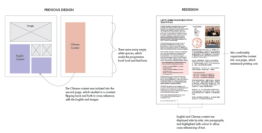
Re-balancing the English and Chinese Content
From observing how the client read through the content in both Chinese and English, we found that that there was a visual disconnect between the English and Chinese texts from the previous designs. It was difficult to identify which Chinese texts were direct translation of the English information, and the Chinese content felt secondary to the English content. Since the Academy's clientele and sponsors were increasingly more Chinese-language oriented, we needed to ensure their reading experience was considered.
From observing how the client read through the content in both Chinese and English, we found that that there was a visual disconnect between the English and Chinese texts from the previous designs. It was difficult to identify which Chinese texts were direct translation of the English information, and the Chinese content felt secondary to the English content. Since the Academy's clientele and sponsors were increasingly more Chinese-language oriented, we needed to ensure their reading experience was considered.
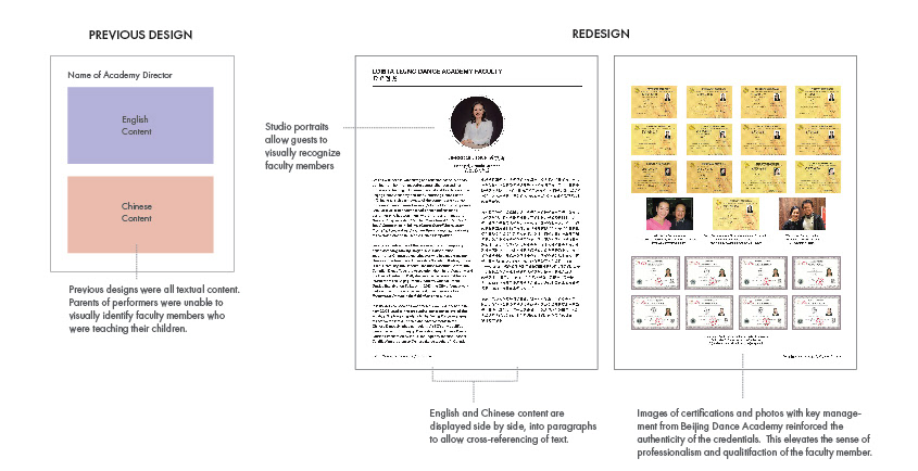
Showcasing faculty credentials to elevate + differentiate the Academy from other similar Canadian institutions
Education and professional certifications are highly valued by the Academy's clientele, and employing faculty all with formal credentials from Beijing Dance Academy is the unique feature of the school. From the client interviews and participatory sessions, we wanted to leverage this insight in the redesign to elevate the prestige of the school, which can generate for more sponsorship and student registrations.
Education and professional certifications are highly valued by the Academy's clientele, and employing faculty all with formal credentials from Beijing Dance Academy is the unique feature of the school. From the client interviews and participatory sessions, we wanted to leverage this insight in the redesign to elevate the prestige of the school, which can generate for more sponsorship and student registrations.
SAMPLE DESIGNS (2017-2019)
Printed poster and program books. Digital distribution of poster across social media platforms including Facebook, Instagram, and WeChat. (Sample Images Below).
I was initially brought on (in 2016) to assist with the recital program's layout design. As my client enjoyed the work and the collaborative process, my role has since expanded to creating all the design work for the annual recital and the Academy's professional dance companies.
I was initially brought on (in 2016) to assist with the recital program's layout design. As my client enjoyed the work and the collaborative process, my role has since expanded to creating all the design work for the annual recital and the Academy's professional dance companies.
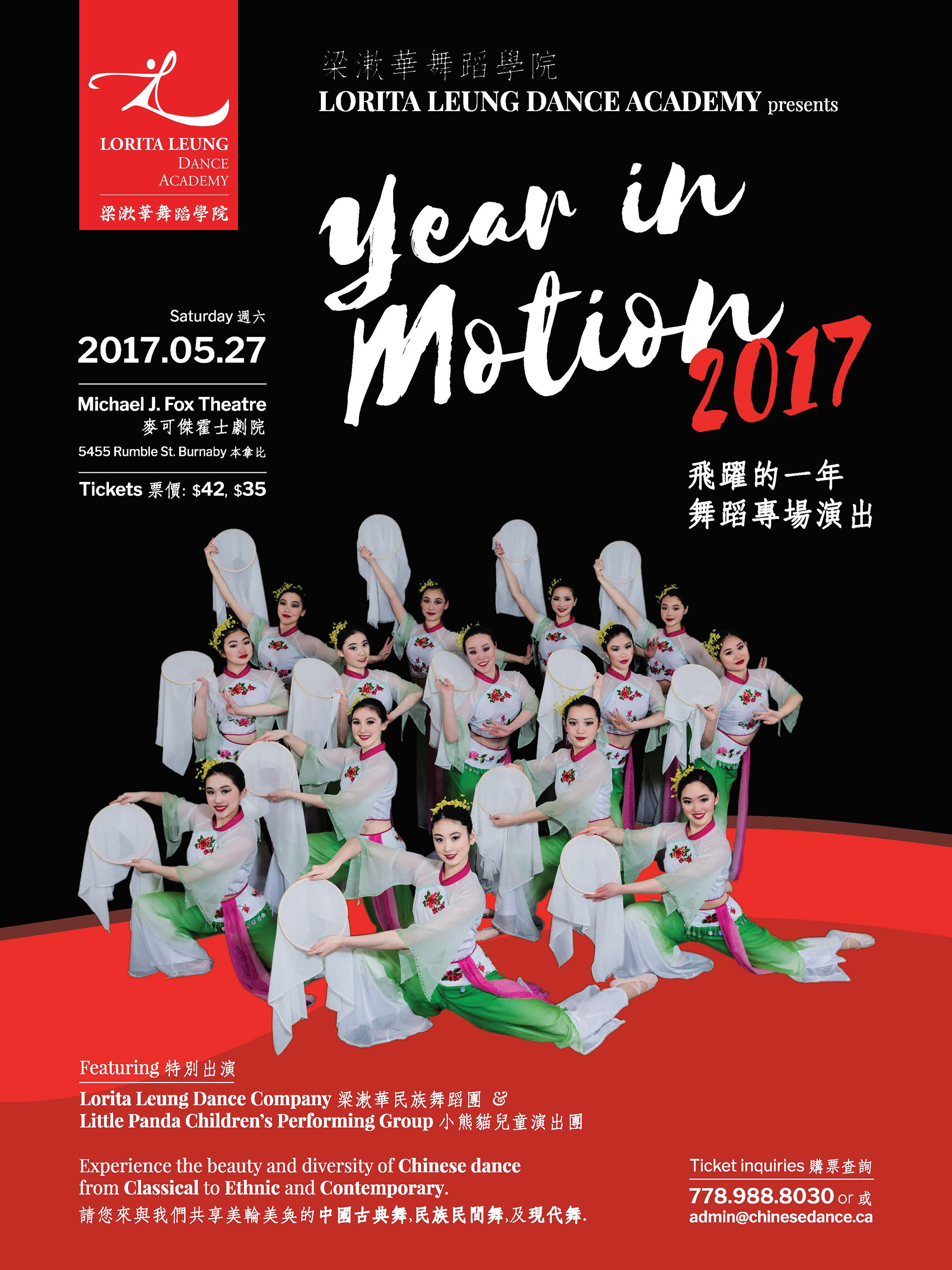
Year in Motion Recital Poster 2017
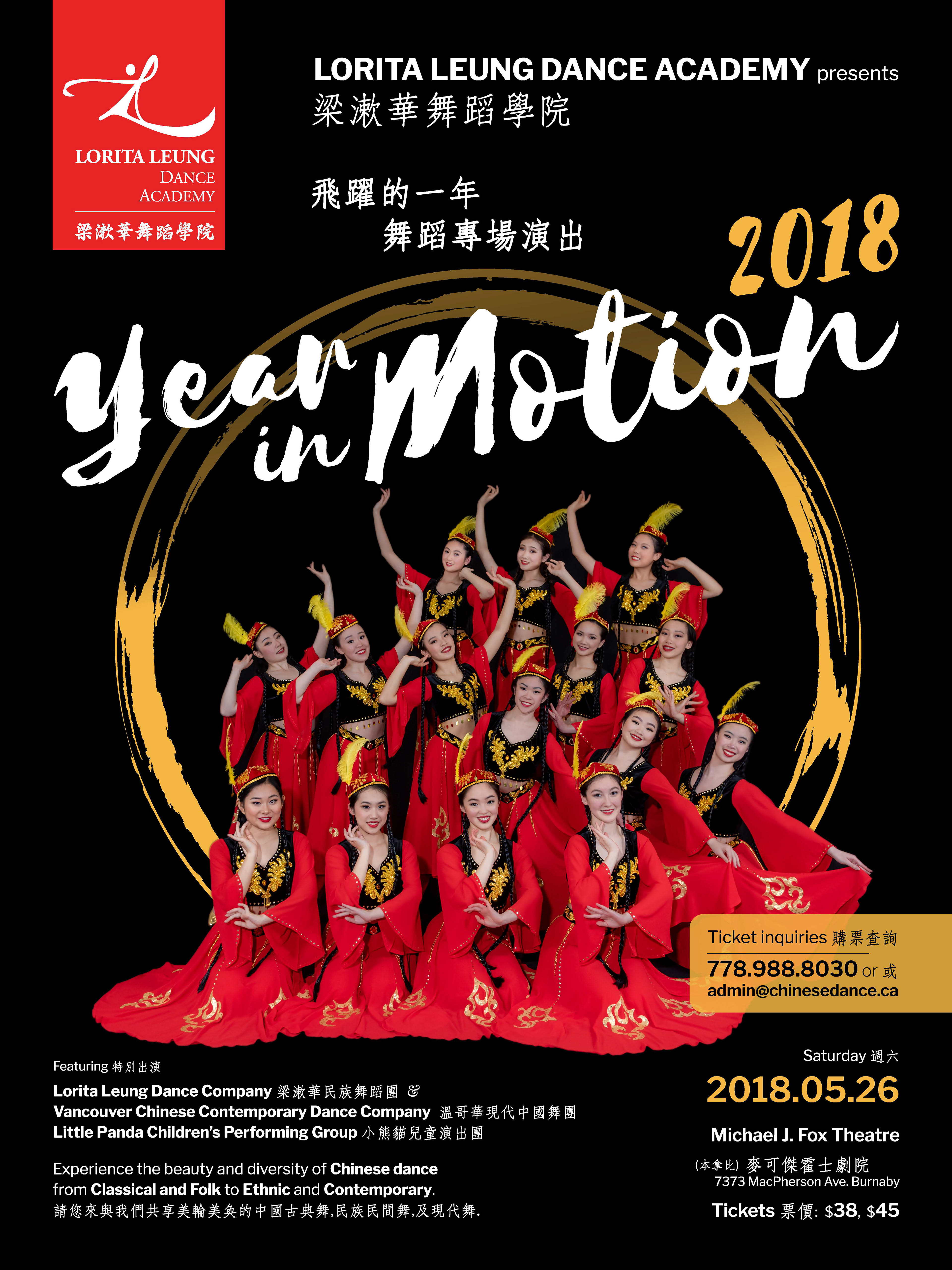
Year in Motion Recital Poster 2018
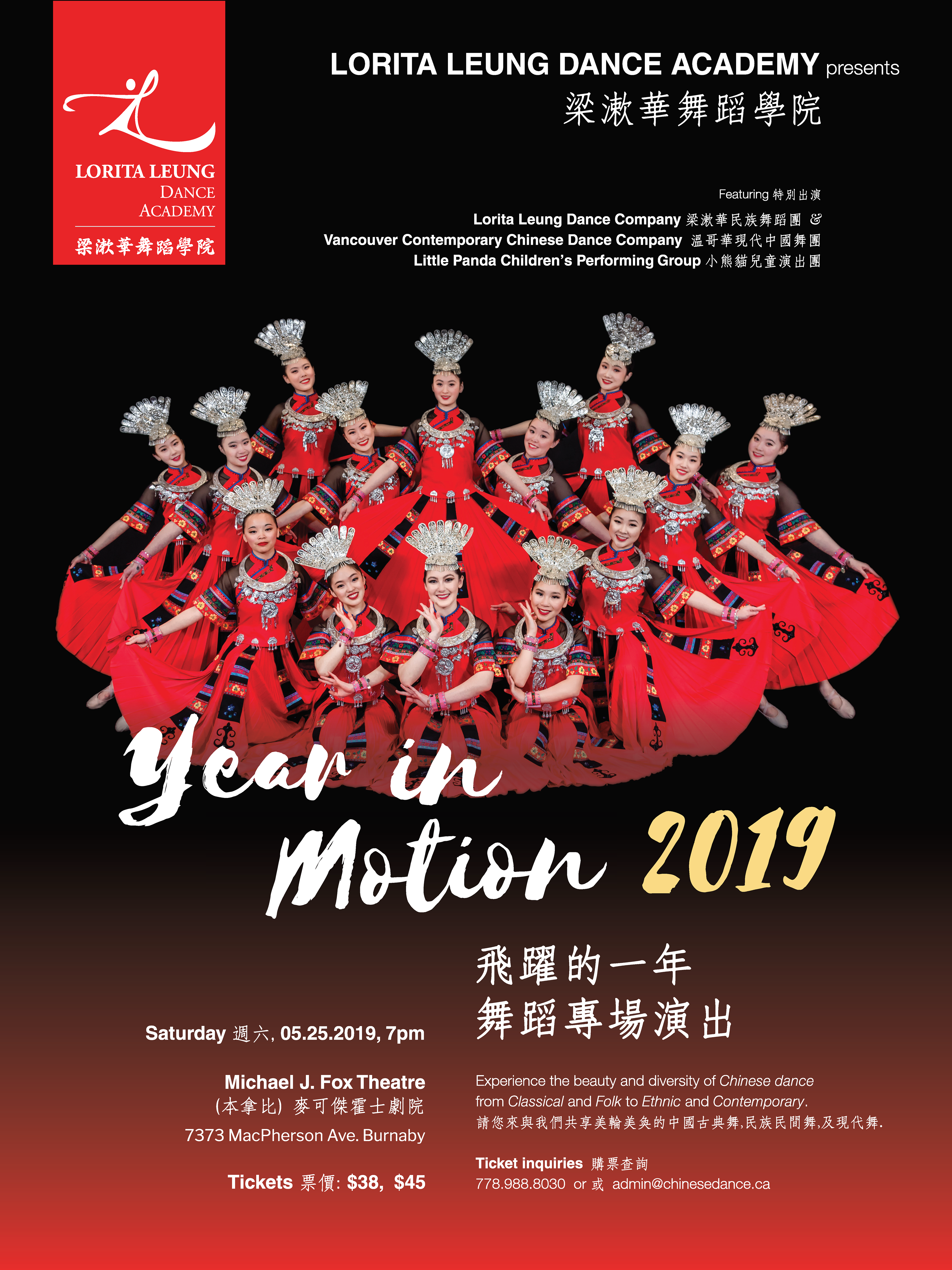
Year in Motion Recital Poster 2019
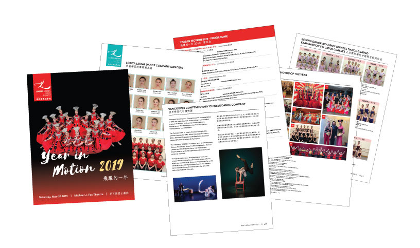
Year in Motion 2019 Program
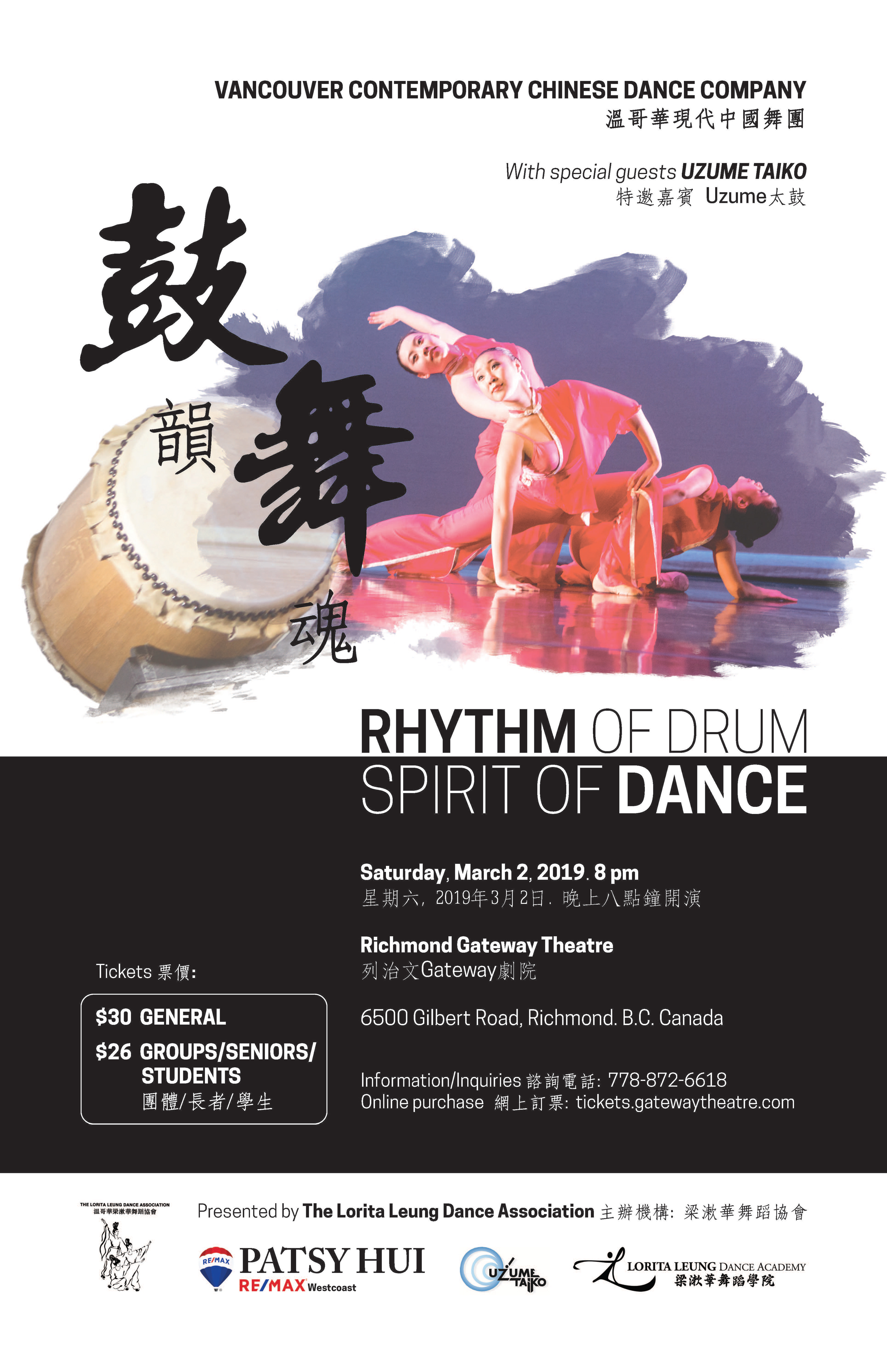
Vancouver Contemporary Chinese Dance Company Performance
KEY REFLECTIONS
Before this project, my working process with a client usually involved an informal discussion, a draft review, and final product delivery. I found that clients felt less connected towards how their product was developed and were more apprehensive and cautious to new design changes. Through engaging in participatory design, it gave me the opportunity to really actively listen and respond with my clients all the way through. For the client, the feeling of being involved throughout the entire process instilled greater trust to me as a designer as they can see how their input is integrated within each iterations.
What is one thing that I have learned in the collaboration process?
Finding a balance- the give and take, the dance between your professional recommendations and what the client feels and wants. Create a list of wants and needs with reference to the main goals and objectives to help prioritize and guide the iteration process in a timely manner.
Finding a balance- the give and take, the dance between your professional recommendations and what the client feels and wants. Create a list of wants and needs with reference to the main goals and objectives to help prioritize and guide the iteration process in a timely manner.